Heuristic Evaluation
Issue 1
Defined:
Some links are not as noticeable or difficult to find.
Explained
Some links are not immediately obvious or easy to locate.
While most images on the website function as links, certain sections lack this feature.
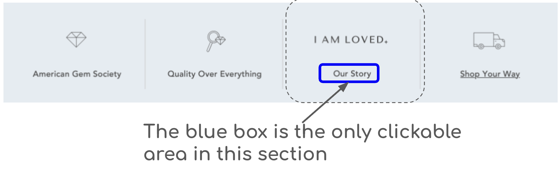
For example, as can be seen in the image below, the text on the at the bottom of does not clearly appear as a clickable link.
Users must hover over it with the cursor to see a visual indication, such as underlining.
Additionally, the diagram above the text is not an active link.
On touchscreens, such as smartphones, these links are not visually distinguishable, making it difficult for users to identify clickable elements.
Heuristic Violations:
4 : Consistency and Standards
Severity:
2 : Minor usability problem
Issue 2
Defined:
Large numbers are not broken up and difficult to read and verify
Explained
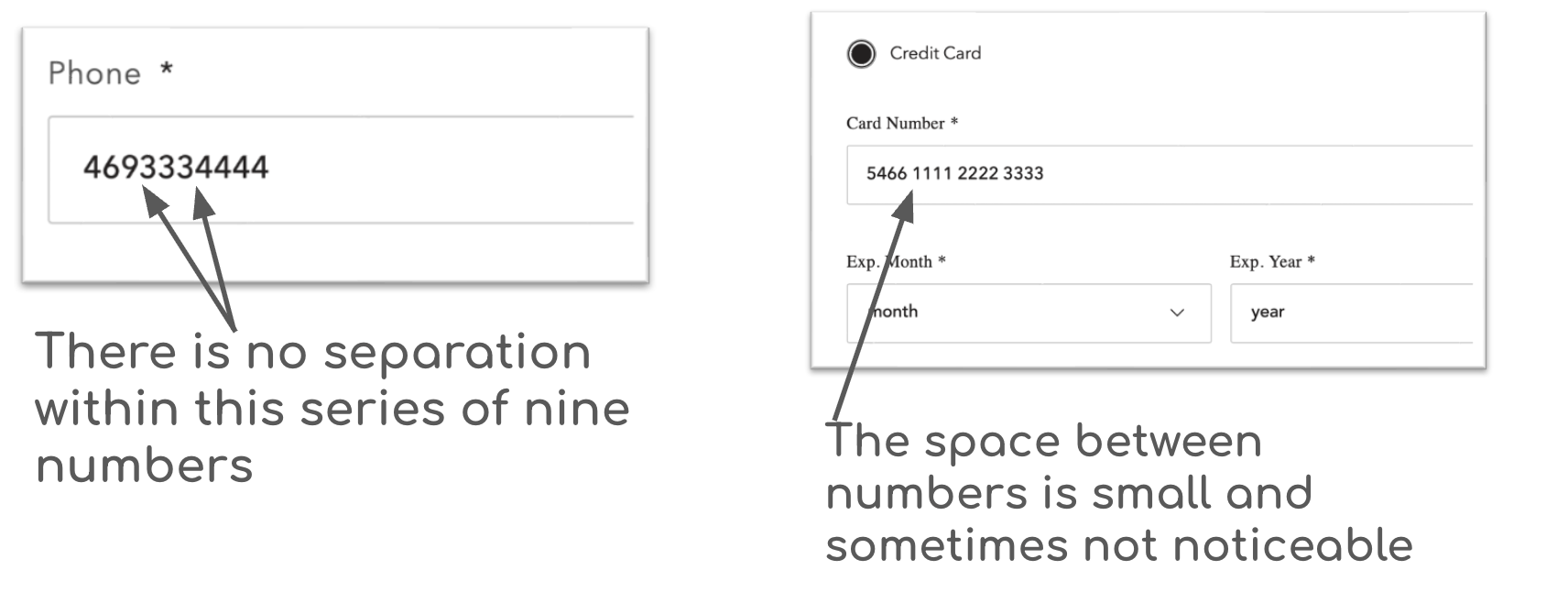
The phone number input field does not format the numbers according to the standard (XXX) XXX-XXXX layout or offer appropriate spacing between the numbers, which may hinder verification.
The credit card number input field has minimal spacing between each set of four digits, making it difficult to accurately enter and verify the information.
Implementing clearer separation and formatting could enhance usability and accuracy.
Heuristic Violations:
4- Consistency and Standards
5- Error Prevention
Severity:
2 : Minor usability problem
Issue 3
Defined:
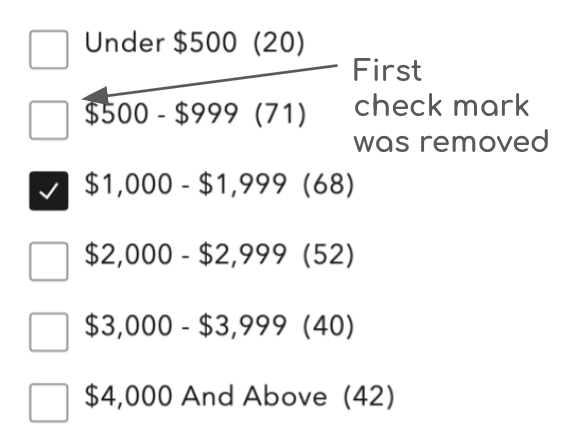
The price filters fail to allow for multiple price points.
Explained
When browsing across a broader price range and selecting multiple price points, the system retains only the most recent selection.
A square checkbox element typically indicates that multiple options can be selected simultaneously, allowing users to choose several boxes.
However, the system constrains the selection to a single predefined price range at a time.
Heuristic Violations:
4 : Standards and Consistency
7 : Flexibility and Efficiency of Use
Severity:
2 : Minor usability problem